Friday, November 9, 2012

Chapter 14_Final Words

Overall, I was fairly pleased with the project. I think that the need for a community driven space for interaction and social exchange is crucial in times of mass-media and a downturn in traditional social wayfinding locators and in turn, locations. 
By identifying and revealing the currently hidden process of food production/processing/transport, it is possible to proximate the everyday or local issues that ask questions like "where does my food come from? How is it grown? How can I cook with it?" A localised food production agenda is something community members can aspire to and use as a building block to better learn about ecological, efficient and delicious food.  
As an ambition; local food growth, cooking and leisure in a surreal environment of rural reminiscence is all a tool to translate or abstract the global concerns which impede and alienate social exchange within communities.
The building recreates this through a series of metaphors, framed views and particular emotions induced by architectural delights. 
The overall concept of a community food exchange for trading food, meals, ideas and knowledge is met with an undulating landscape broken up to reveal the top down and bottom up process of local and global ideals.
All-in-all, I would like to spend a number of weeks recreating the project without the pressure of time.  Perhaps I would begin by incorporating a number of ideas that have since been developing in my mind, or been suggested to me by valued peers. Which, I think, is something I have learned over the last four years to be one of the most valuable tools in architectural design workflow. 
I have also taken away from this unit a yearning to maintain and continue developing the theme of local and global concerns.  While I don't believe the architecture of one building can solve all the world's problems; merely the premise of raising concern is enough to get the proverbial ball rolling. So, to summarise I would like to quote again David Hogarth, as a challenge to contemporary architecture, connecting in perfect hetereotopia - "the abstract global and the proximate everyday or local."

Thanks to my class peers, Peter and Yasu, for the fantastic semester!

Wednesday, November 7, 2012

Chapter 13_Final Images

Masterplan


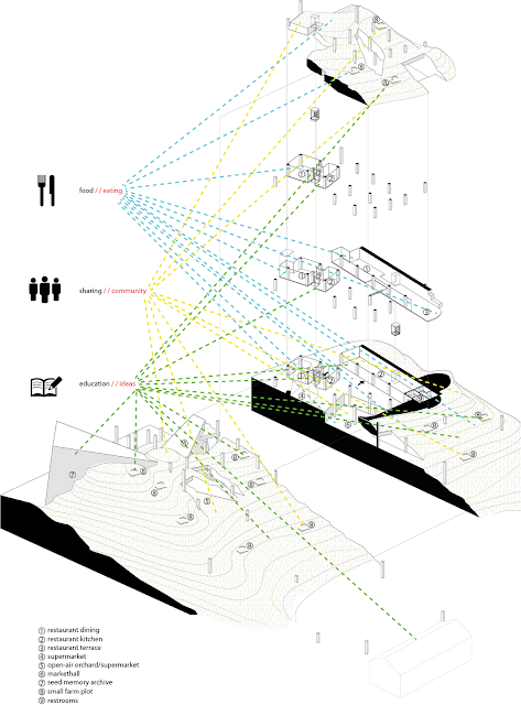
Exlpoded Axonometrics
Use/Amenities


Program


User Navigation
In this image it is possible to understand the 'scene'. 

Yellow line = 6am, User X: local walks to Paddington Central to purchase fresh produce from the daily morning markets - sold to him by community growers on the landscape above the street, or even perhaps, from one of his neighbours who recently has grown a patch of tomatoes in his backyard, thanks to learning skills at Paddington Central.  User X then emerges from the hustle and bustle of the morning markets to the terrain where he trains for 40mins with a local fitness group on the expansive new landscape.

Red line = 10am, User Y: a passer by walking along the Paddington commercial strip for a day of leisure, is drawn in by the building. Upon navigating he sees sunlight striking through the roof and upfront, ahead. Following the light he finds himself breaking through to the park. He remains there for the day, thankful to have found a large green community space in Paddington.

Blue line = 12pm, User Z: jogs from her house to the centre, straight up over and between the built structure to the field where she and her netball team practice. At the end of the training, the netball team tend to a small plot which they are growing passion fruit to make passion fruit juice on match days.  The surplus will be sold as a refreshment by walking around the park landscape and offering to other users of the green landscape.

Green line = 2pm, User W: comes to Paddington on her lunch break, to kill time and enjoy the natural setting.  With plenty of time to spare, she first walks through the Seed Memory Archive.  After learning food origination in the archive, she decides to purchase pumpkin seeds to plant at home that afternoon. She passes through the supermarket to purchase a lunch to eat on the hill overlooking farms and parkspace.

Orange line = 5pm, User C: the chef of a Paddington Central restaurant is preparing meals for the evening. The restaurant is all out of ginger and garlic. He simply jumps into the elevator and goes to the small farm plot belonging to the restaurant to take fresh stock to use for the evening. 

Purple line = 7pm, User A: a couple, who live locally, go to dine in a Paddington Central restaurant.  Unfortunately, the restaurant is fully booked for another 25 minutes. To pass time, the couple take a drink and using the glass elevator, go to the green fields above to enjoy the balmy summer evening and watch the sunset over the fields.


Future Capabilities
There exists the opportunity for an laboratory to be built in the future for scientific and education purposes pertaining to food.


Conceptual Section


Detail Images
Hydroponic wall


Roof depths


Structural Columns


Water tank


Sunday, October 21, 2012

Chapter 12_ Design Criteria_Lecture & Tutorial

This lecture prompted me to begin thinking about the communication of my proposal.  

There are a number of considerations to make...
  • Reality
  • Creativity
  • Purpose
  • Navigation
  • Integrity
  • Presence and Identity
  • First-Person Experience

I think it will be crucial to tie all of these factors into the Architecture Fiction theme. Applying SCENE, STAGE and SCRIPT...

To look at each one on its own and how I might address it:

REALITY - The reality of my intervention revolves around the idea of Food as a performance or theatre, and lifting the veil on the food process showing how food gets from seed to bowl. To achieve this, I think it will be important to show (probably mostly as facts and figures):

  1. Food as the centre of necessity - quote food consumption, earnings of the woolworths store in paddington, maybe compare statistics of food consumption and production/also revisit stuff from interim presentation. Represented with live 'logging' of graphs in a video?
  2. Despite the number of families living in the area, the lack of community in Paddington.. why? topography, traditional hierarchy, consumer fetish, no gathering place (All with diagrams?)
  3. The veil which hides the food process + the damages caused to the environment in production/distribution + lack of education/knowledge about food. (diagrams + facts)

CREATIVITY - As well as an exercise of architectural quality or aesthetics.. it will be important to show creativity of HOW we can learn from the project and give an insight of what the future could be like: 
In my case - how an architectural intervention can link food, community, values and knowledge.  The axes of program and creative adjacency of uses (mentioned in an earlier post weeks ago) should result in an effective and resolved solution.
I would like to see the program as a cyclical and interchangeable process which can adapt and suit the needs of a user: linking food (eating), community (sharing) and education (ideas of growing food). Each process can inform the other in any chronology (not necessarily chronologically as in order of navigation)... still not sure how I will represent this.


Reality and Creativity Summary:
facts + figures 
diagrams of current context (inc. Locale map)


PURPOSE - I think that this section will importantly address the 'exactness' of the concept and how it all fits together architecturally, from the bottom up and the top down. 

  1. The facts and figures of what WILL change once the proposal is realised. i.e. decrease environmental damage due to food distribution by XXX.XX% 
  2. In plan I will show USE (i.e. "Learn") highlighted by colour, level of function with drag-away nodes (to describe the difference between a casual and formal interaction i.e. sit down in restaurant, or be in the park and eat 'street food')   
  3. On the side will be illustrated facts (see point 1) like: daily production (kg of food, farmed hours (internal/external?), diagramme number of seats in the restaurant, passer-by due to public transport 
  4. Also on the side - diagrammed amenities  - i.e. Restaurant, terrace allotment, supermarket, lab, archive... 
  5. Site section this will be an conceptual section to highlight the arrangment and/or conglomeration of activities. PEOPLE  shown!
  6. Future possibilities of the future project...?
  7. How will the building be built installed or used over time? will it overgrow? take over neighbouring properties: Show that the market will be used as either storage or as a selling market place - the owners of plots can choose this. Use of water tank could be adapted. Future lab for education. Spilling of markets out onto street or out into the park/farms
Purpose Summary: 
Conceptual section 
Programmatic/amenity focused floor plan
Facts/benefit of the building 
Future use 'spillage' of markets (conceptual plan view)

Site section example of how conceptual I would like...
Source: http://www.crab-studio.com/wp-content/uploads/2012/06/Towers-w-o-w.jpg

Source: http://25.media.tumblr.com/tumblr_mbdohduBgp1rruc14o1_1280.jpg


NAVIGATION - Important to show the progression of space from busy hub of activity to surreal calm of the farm/park.
  1. Axonometric (maybe exploded?)
  2. Show google images of bikes with baskets for food, buses, 
  3. Locale plan map - where will users come from and why? just a few examples
  4. To tie in with the axo - Flow chart type diagramme which shows events within the building. i.e. marked on axo as red - purely going to shop, green - shop and meal, yellow - park. These are the characters acting out their script. It shows the distinct scenarios and difference between a casual and formal interaction with site i.e. sit down in restaurant, or be in the park and eat 'street food')
Navigation Summary:
Axonometric
Google image layers for identification and memory
Locale map
Flow chart diagrams (supplement axo)


Examples illustrative of planned axonometric treatment

Source: http://www.graduatearchitecture.com/PROJECTS/ENGLISH/2012/entries/0114/Almudena_Cano_ACP12.pdf


Source: http://25.media.tumblr.com/tumblr_m4xat5wP0T1qe0nlvo1_500.jpg


INTEGRITY - thinking in terms of bottom up and top down...
  1. How some detail works in a type of catalogue thing- like how my columns are half planter boxes, half architectural component, or the depth of the roof to be capable of different growing plants, the light system illustrative of water level in water tank and the system of management it uses)- feeds farms + the hydroponic aqua tanks... 
  2. Tectonics and structure - glass to 'lift the veil', thick walled rammed earth for solemn archive, structural grid for storage and markets.
  3. Exploded axonometric of the restaurant cube: kitchen, dining rooms and up to the farm above - numbered with legend? *low priority* faint lines for surrounds
  4. How will 'Mark' or 'Jenny' and 'Tom' use their urban alloted farm - a diagramme which shows the different tiers of production as a 'farm' - broad use community farm used generally for education, shared allotments spaces between different community members for food source? 
  5. Diagrams - The rationalisation of how the building relates to community (The horizon of greenery + others)
Integrity Summary:
Catalogue of detailed designs (x3)
Material analysis
Exploded axonometrics (x2)
Rationalised design diagrams (many)

PRESENCE + IDENTITY- mainly atmospheric images, collage, or sketches - 2 maybe 3... Paddington central as a landmark

1ST PERSON EXPERIENCE - 2 maybe 3 perspective images?


Overall, I think I'll provide one scenarios, to somehow in lieu of "the abstract global and the proximate everyday or local." amalgamate climate, culture, ecological, economic, geographical, political, social and technological. 

The scenario I have in mind will depict the distinctive formal and casual operation of the building across many layers.

Friday, October 12, 2012

Chapter 11_Venice Biennale

This lecture gave me some ideas about presentation and final product aesthetic.

In terms of what goes on my panels, I think it will be more important to show how the building works, rather than developing a fantastic 'hero shot'...

Sunday, October 7, 2012

Chapter 10_A Digital Interface

Consider the digital aesthetic:

"The world is engaged and ignored in a very new way." Zygmunt Bauman

The Challenge for contemporary architecture: is to connect the real and virtual worlds - "the abstract global and the proximate everyday or local." David Hogarth

Technology has influenced the daily lives of a great proportion of people on this planet, so much so that a manifested technology aesthetic is now apparent.  In the case of the inspired, architects are taking designs and technologies as far as literal interpretations of science fiction - whereby our built environment is as much designed by authors of novels as it is architects.   
Over due course, citizens of cities have been rewired to the digital age.  Virtual technologies attract audiences whose expectations have been informed by computer gaming and interactive online experiences.  There is certainly an appeal and approval for the familiarity a science fiction aesthetic. Perhaps seen as societal progression.

A society which appeals to such consumers of technology has embedded point of view (POV) to the world of dynamic motion game reflections, and an entire aesthetic I would describe as experiential - a look, feel and importantly, sound that recreates what the architect imagines for the user.

However, the architect should be wary that their POV architecture is not purely diaries, but rather multifaceted accounts that form a kind of mosaic view of the world, so as to give a heterogeneous outlook.

Saturday, October 6, 2012

Chapter 10_Sequence

Following from the Guest lecture by Alexis Sanal, I came across this quote which highlights the theme of sequence that Alexis also addressed

"Yet Architecture is inhabited: sequences of events, use, activities, incidents are always superimposed on those fixed spatial sequences.  These are the programmatic sequences that suggest secret maps and impossible fictions, rambling collections of events all strung along a collection of spaces, frame after frame, room after room, episode after episode."
Bernard Tschumi - "Sequences" Architecture and Disjunction 1996,153-168

Friday, October 5, 2012

Chapter 10_Initial Sketches

Some sketches and ideas that I have been working on over the last week and a bit...


Chapter 10_Praxis_SANAL Guest Lecture

Alexis introduced an idea that I found interesting: people/clients don't ask for a lecture hall - they ask for a space to talk to people.
I think here I began to re-assess the programmatic structure of Paddington a lot differently.  What do the the people of Paddington need? Namely - open space for community activities, a place to buy and eat food, and most importantly a place to learn about food.

Alexis also made some good points to consider:
  • What draws us into a place? why do we want to spend time there?
  • Keytheme: Culture of Villages - the human scale of a micro village within a macro urbanity gives a community something they can develop on their own initiative and have pride about.   To address this there are both active, instrumental spaces (designed) and passive spaces that will adapt to emergent activities. 
  • Sequence of spaces
  • Famed views, mind and narrative
  • Memory
  • Threshold spaces

Monday, October 1, 2012

Chapter 09_Pyschogeography

To assist my Architecture in becoming an 'assistive device' I began investigating assisstive design techniques. 

Consider the statement:
A history of the city
A memory of life

Break it down:
memory vs history

Architecture2


Psychogeography is a theory of urban form developed by Situationist, Guy Debord. A main basis for his analysis encourages a meaning of a place in history by an individual's association of:
1.  Memory
2.  Experience
3.  Values

To apply Guy Debord's theory of Pyschogeography, I developed a criteria to directly assess and describe the characteristics and dynamic processes of the immediate Paddington Central area.  These scenarios create small narratives and articulate complex emergent phenomena via four basic processes...
1. Erasure: to take things away, to remove
2. Origination: to create a point in time where something new emerges
3. Transformation: continuous change from A to B
4. Migration: moving through, ephemeral presences

It is hoped that these processes will later inform and structure programme and perhaps prototype design.